DULKS becomes Feldklasse.
After revolutionising hoeing technology, our company now revolutionises itself. The new brand name Feldklasse (field class) expresses, better than its founder name, what our products stand for: quality, closeness to nature and reliability in everyday practice.


New name, new brand appearance, new web presence, new product design. Wow!
2020 was, in many ways, a challenging year for our team. To prove oneself and even take a step forward, as a start-up during a pandemic, is really not an easy task. In retrospect we can proudly say that we did quite well.
For example, we haven't just pushed the progress of our machines. We are also glad to welcome many new customers, who we have been able to convince with our machine concept. Furthermore, we have moved to a larger office, allowing enough space for further growth.
To communicate our successful way also to the outside world, we decided to ask the Düsseldorf-based brand agency arndtteunissen in early 2020 to support us.
As a result of this close co-operation, we were able to sharpen our positioning and also came to think that we needed a new brand name. Our machines are a progressive and sustainable step for every field in this world. They are certainly a class of their own and, from a technological point of view, even world class. Because world (Welt) and field (Feld) sound very similar in German, our new name really makes sense: Feldklasse.
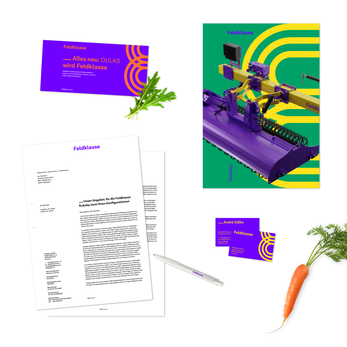
Based on this positioning, our values and strategy, arndtteunissen developed a new corporate design and web presence for us. We hope you like it as much as we do!
The idea of our brand is reflected by our new design. And that's important to us: we always keep in sight our objective – which is an active, contemporary and sustainable contribution to the future of agriculture in harmony with nature. And we want everyone to see this.
Therefore, the optimistic mood has made us opt for a coloured and cheerful design that visually stands out in its target market. An exciting, recognisable word mark and typography also help us in that respect, and will be consistently visible in our whole brand communication.
»The new corporate design gives us a real boost in terms of external appearance and sales power.«
André Dülks, Founder and Managing Director of Feldklasse.
“This was real fun! With Feldklasse, we were able to launch an attractive and exciting new brand appearance. Very closely aligned with the values and positive attitude of the brand, something special has been created. Something of which our strategists, designers and web developers can be really proud. Also, I want to thank everyone involved for their professional co-operation and creative exchange. That was the foundation for this excellent, interdisciplinary brand project. Way to go!“
Benjamin Arndt, managing partner of arndtteunissen brand agency
Even our machines are delighted, and enlightened, by the bright colours of this new design concept. Looks quite unusual, doesn't it? We wanted to set and example, and you can join us on this successful and sustainable path. Are you ready?
Your Feldklasse team